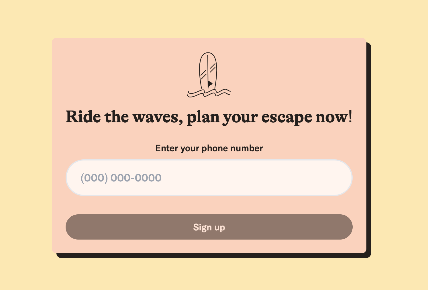
But it's really just sign up page.
The origin story of how this ... thing came to be isn't that exciting.
If you're really curious ... click here
It's a re-brand of a take-home exercise I did for an interview. The goal was to improve on the existing UI/UX sign up flow.Creating a custom logo from a reference ... 'cause I'm more of a longboarder 🤙
Buuuuut ... the process of building this sign up flow was really fun. Most of the fun was derived from working with Next.js and Tailwind CSS.
Next.js offers a lot of helpful tools to make the development process easy and fast. Some features I like about Next.js: page routing, image caching, external font loading, and many more. Plus, their documentation is great.
Meanwhile, working with Tailwind CSS made me enjoy not having to name another CSS class for the N-th time. It made re-think how efficient inline CSS can be when done right ... *cough* styling emails still suck *cough*. Going forward, I'll definitely want to use Tailwind CSS again.
On another note, I'm really happy with some of the UI/UX features I added. They include: auto-submit 2FA code, reset button on phone number entry, auto format phone number input, etc. These features make the sign up process more approachable and accessible and I'm happy with how it turned out 😊.
All in all, this mini-project was a good exercise on building a site with Tailwind and Next.js and how to improve the UI/UX of an existing app.
